Brother Bill’s Helping Hand: Inspired by these incredible helpers
Project Scope
Branding
We are always inspired by our non-profit clients and partners for the incredible work they do to support our community. Brother Bill’s Helping Hand enriches the lives of men, women, and children in the community of West Dallas by empowering through learning, encouraging through relationships, and ensuring the essentials of life. We asked the executive director of Brother Bill’s Helping Hand who engaged us to build the organization’s new website if we could also design a new brand that represented the work they do and he supported the idea. Brother Bill’s Helping Hand exists to help in any way they can, so our creative team designed something that fits them perfectly.

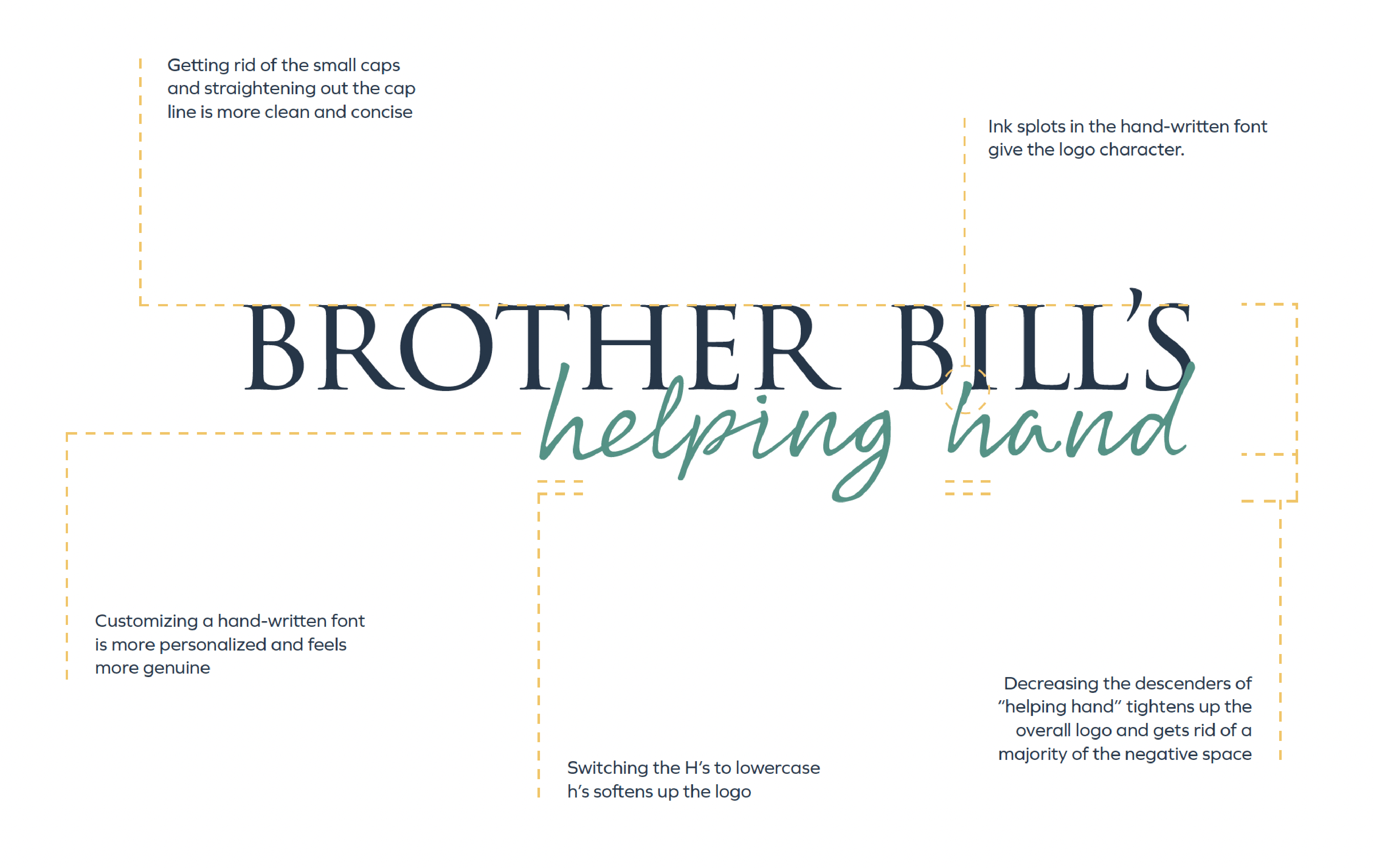
01 Logo reasoning
Because of the existing signage and other branded materials Brother Bill’s had already invested in, we refreshed their logo to something more modern and friendly that hinted towards their current logo.

02 b icon
The ‘b’ emblem in the new logo is actually an outline of what hands look like when making the sign for ‘help’ in American sign language.
![]()
03 Iconography
We designed a set of custom icons to represent the multiple services they provide.
![]()
04 Animation
Below is an animation we created to promote their new website.
Our team is proud to have helped the helpers tell their story with a compelling new brand.

